Our World in Data presents the empirical evidence on global development in entries dedicated to specific topics.
This blog post draws on data and research discussed in our entry on Causes of Death.
One of the primary motivations for our work at Our World in Data is to provide a fact-based overview of the world we live in — a perspective that includes the persistent and long-term changes that run as a backdrop to our daily lives. We aim to provide the complement to the fast-paced reporting we see in the news. The media provides a near-instantaneous snapshot of single events; events that are, in most cases, negative. The persistent, large-scale trends of progress never make the headlines.
But is there evidence that such a disconnect exists between what we see in the news and what is reality for most us?
One study attempted to look at this from the perspective of what we die from: is what we actually die from reflected in the media coverage these topics receive?1 To answer this, Shen and his team compared four key sources of data:
For each source the authors calculated the relative share of deaths, share of Google searches, and share of media coverage. They restricted the considered causes to the top 10 causes of death in the US and additionally included terrorism, homicide, and drug overdoses. This allows for us to compare the relative representation across different sources.2
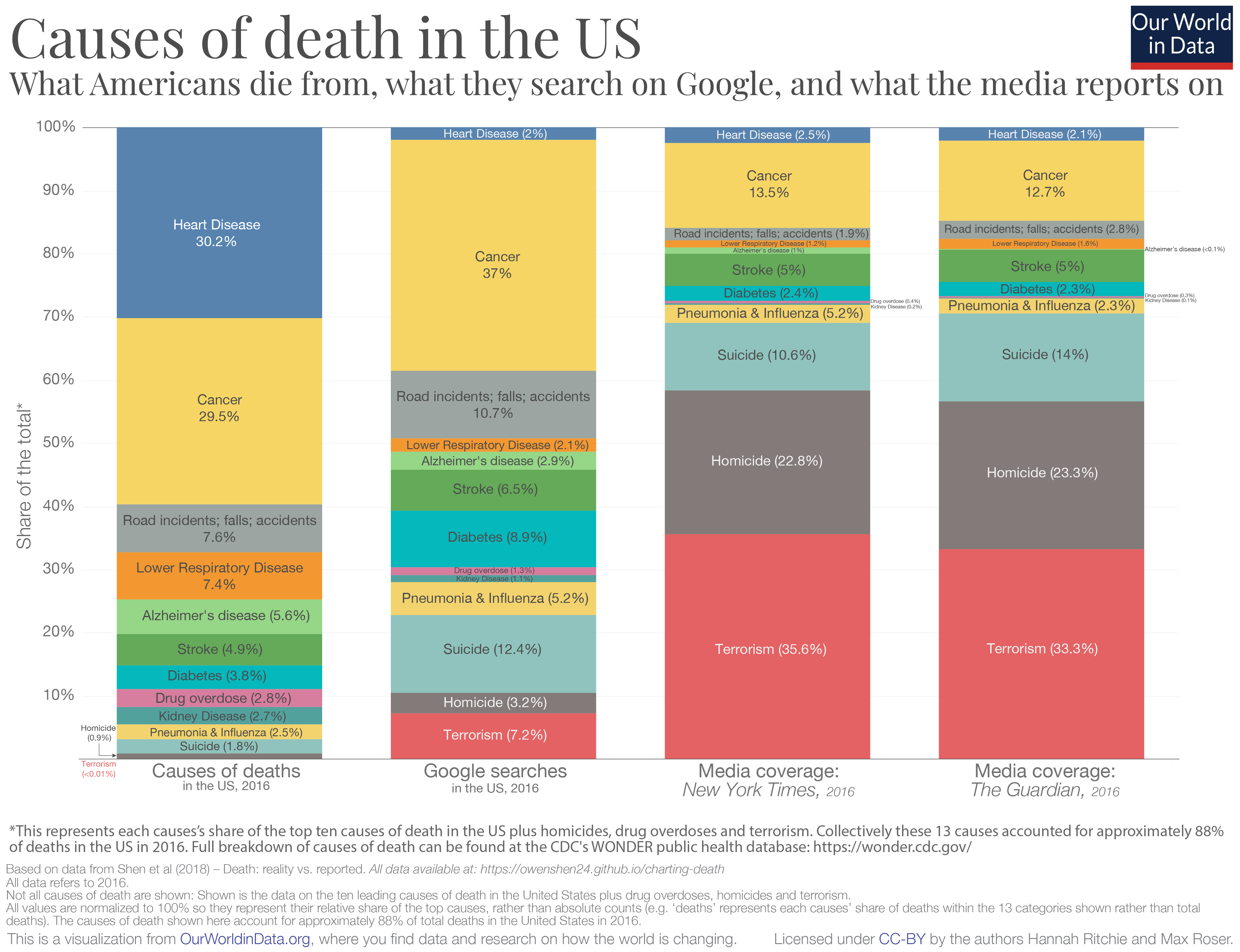
What we die from; what we Google; what we read in the news
So, what do the results look like? In the chart below I present the comparison.
The first column represents each cause's share of US deaths; the second the share of Google searches each receives; third, the relative article mentions in the New York Times; and finally article mentions in The Guardian.
The coverage in both newspapers here is strikingly similar. And the discrepancy between what we die actually from and what we get informed of in the media is what stands out:
around one-third of the considered causes of deaths resulted from heart disease, yet this cause of death receives only 2-3 percent of Google searches and media coverage;
just under one-third of the deaths came from cancer; we actually google cancer a lot (37 percent of searches) and it is a popular entry here on our site; but it receives only 13-14 percent of media coverage;
we searched for road incidents more frequently than their share of deaths, however, they receive much less attention in the news;
when it comes to deaths from strokes, Google searches and media coverage are surprisingly balanced;
the largest discrepancies concern violent forms of death: suicide, homicide and terrorism. All three receive much more relative attention in Google searches and media coverage than their relative share of deaths. When it comes to the media coverage on causes of death, violent deaths account for more than two-thirds of coverage in the New York Times and The Guardian but account for less than 3 percent of the total deaths in the US.
What's interesting is that Americans search on Google is a much closer reflection of what kills us than what is presented in the media. One way to think about it is that media outlets may produce content that they think readers are most interested in, but this is not necessarily reflected in our preferences when we look for information ourselves.
[Clicking on the visualization below will open it in higher resolution; The chart shows the summary for the year 2016, but interactive charts for all available years is available at the end of this blog.3]
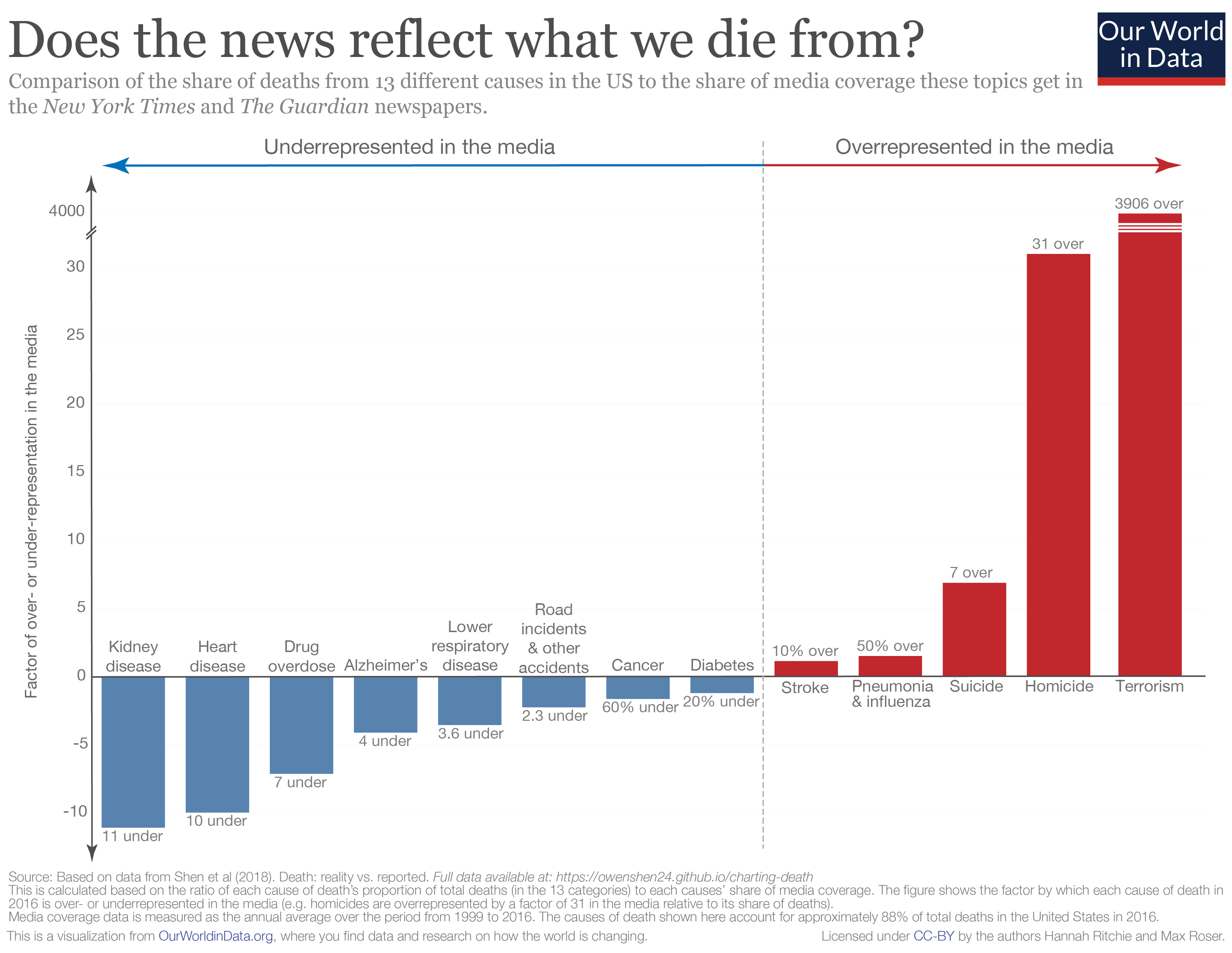
How over- or underrepresented are deaths in the media?
As we can see clearly from the chart above, there is a disconnect between what we die from, and how much coverage these causes get in the media. Another way to summarize this discrepancy is to calculate how over- or underrepresented each cause is in the media. To do this, we simply calculate the ratio between the share of deaths and share of media coverage for each cause.
In the chart below we see how over- or underrepresented each cause is in newspaper coverage.4 Causes shown in red are overrepresented in the media; those in blue are underrepresented. Numbers denote the factor by which they are misrepresented.
The major standout here – I had to break the scale on the y-axis since it's several orders of magnitude higher than everything else – is terrorism: it is overrepresented in the news by almost a factor of 4000.
Homicides are also very overrepresented in the news, by a factor of 31. The most underrepresented in the media are kidney disease (11-fold), heart disease (10-fold), and, perhaps surprisingly, drug overdoses (7-fold). Stroke and diabetes are the two causes most accurately represented.
[Clicking on the visualization below will open it in higher resolution].
Should media exposure reflect what we die from?
From the comparisons above, it's clear that the news doesn't reflect what we die from. But there is another important question: should these be representative?
There are several reasons we would, or should, expect that what we read online, and what is covered in the media wouldn't correspond with what we actually die from.
The first is that we would expect there to be some preventative aspect to information we access. There's a strong argument that things we search for and gain information on encourages us to take action which prevents a further death. There are several examples where I can imagine this to be true. People who are concerned about cancer may search online for guidance on symptoms and be convinced to see their doctor. Some people with suicidal thoughts may seek help and support online which later results in an averted death from suicide. We'd therefore expect that both intended or unintended exposure to information on particular topics could prevent deaths from a given cause. Some imbalance in the relative proportions therefore makes sense. But clearly there is some bias in our concerns: most people die from heart disease (hence it should be something that concerns us) yet only a small minority seek [possibly preventative] information online.
Second, this study focused on what people in the USA die from, not what people across the world die from. Is media coverage more representative of global deaths? Not really. In another blog post, 'What does the world die from?', I looked in detail at the ranking of causes of death globally and by country. The relative ranking of deaths in the USA is reflective of the global average: most people die from heart disease and cancers, and terrorism ranks last or second last (alongside natural disasters). Terrorism accounted for 0.06 percent of global deaths in 2016. Whilst we'd expect non-US events to feature in the New York Times, global news shouldn't substantially affect representative coverage of causes.
The third relates to the very nature of news: it focuses on events and stories. Whilst I am often critical of the messages and narratives portrayed in the media, I have some sympathy for what they choose to cover. Reporting has become increasingly fast-paced. As news consumers, our expectations have quickly shifted from daily, to hourly, down to minute-by-minute updates of what's happening in the world. Combine this with our attraction to stories and narratives. It's not surprising that the media focuses on reports of single (inadvertently negative) events: a murder case or a terrorist attack. The most underrepresented cause of death in the media was kidney disease. But with an audience that expects a minute-by-minute feed of coverage, how much can possibly be said about kidney disease? Without conquering our compulsion for the latest unusual story, we cannot expect this representation to be perfectly balanced.
How to combat our bias for single events
Media and its consumers are stuck in a reinforcing cycle. The news reports on breaking events, which are often based around a compelling story. Consumers want to know what's going on in the world — we are quickly immersed by the latest headline. We come to expect news updates with increasing frequency, and media channels have clear incentives to deliver. This locks us into a cycle of expectation and coverage with a strong bias for outlier events. Most of us are left with a skewed perception of the world; we think the world is much worse than it is.5
The responsibility in breaking this cycle lies with both media producers and consumers. Will we ever stop reporting and reading the latest news? Unlikely. But we can all be more conscious of how we let this news shape our understanding of the world.
And journalists can do much better in providing context of the broader trends: if reporting on a homicide, for example, include context of how homicide rates are changing over time.6 As media consumers we can be much more aware of the fact that relying on the 24/7 news coverage alone is wholly insufficient for understanding the state of the world. This requires us to check our (often unconscious) bias for single narratives and seek out sources that provide a fact-based perspective on the world.
This antidote to the news is what we try to provide at Our World in Data. It should be accessible for everyone, which is why our work is completely open-access. Whether you are a media producer or consumer, feel free to take and use anything you find here.
Additional information:
Shares of deaths, media coverage and Google searches over time
The interactive charts below present the full annual data series published by Shen et al. (2018), and summarised above, on the relative share of deaths in the US, Google searches and New York Times (NYT) and The Guardian media coverage across the 13 cause of death categories. For share of deaths, NYT and The Guardian coverage, data extends from 1999 to 2016. Due to data availability Google Trends data only runs from the year 2004 to 2016.
The relative share of deaths in the United States by cause. These represent the top 10 causes of death in the USA, in addition to terrorism, homicide and drug overdoses which received significant attention. The share therefore represents each causes' share of the total 13 categories (which combined account for approximately 88% of total deaths in the United States).
The relative share of Google searches using keywords and synonyms of the top 10 causes of death in the United States in addition to terrorism, homicide and drug overdoses.
Relative coverage of articles mentioning the top 10 causes of death in the USA (in addition to terrorism, homicide and drug overdoses) in the New York Times (NYT). This is based on the number of articles which mention any of the terms or synonym/related terms (e.g. 'murder' for homicide) in the headline or body text. This is normalized to the relative share by dividing by the total number of articles which feature any of these causes of death.
Relative coverage of articles mentioning the top 10 causes of death in the USA (in addition to terrorism, homicide and drug overdoses) in The Guardian newspaper. This is based on the number of articles which mention any of the terms or synonym/related terms (e.g. 'murder' for homicide) in the headline or body text. This is normalized to the relative share by dividing by the total number of articles which feature any of these causes of death.